These are the top 10 logo trends of 2020
Although a logo is often the face of a company, that does not mean that it must remain the same forever. Major brands such as Apple, Windows , Google, Instagram and Coca-Cola have over the years updated their logos to adapt to the new age. Do you ever think about renewing your own logo? That can certainly be worth it. In the article below we have looked at what the logo industry trends will be in the coming year. We have compiled a brief but insightful overview of the most striking and relevant logo trends that are expected to prevail in 2020. Are you watching?
Simplification

From an ordinary trend, simplification has become an established philosophy. It is abundantly clear that this artistic approach is permanent. A ‘clean composition’ makes the logo more versatile and practical. As a result, a minimalist design remains perfectly readable for all types of backgrounds. Notice how big brands tend to minimalism and rid their designs of excessive words, lines and colors. This is a clear sign that simplification is the logo design trend no. 1.
A fresh look at the geometry

Chances are that you are tired of stiff geometric shapes such as squares and rectangles. Rejoice because the year 2020 is about to bring you some relief! Designers will shift the focus from angular geometry to circles, ovals, ellipses and other similar shapes. If you are passionate about mosaic, you will certainly enjoy the experiments inspired by the low poly style.
New typography
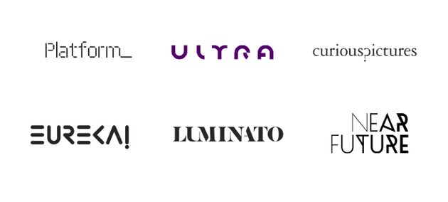
Every year it becomes increasingly difficult to create attractive text-based logos. Fortunately, typography offers a huge playground for experiments. Although finding an unusual way to draw familiar letters and numbers requires a lot of imagination, the final result is definitely worth it. Breathe new life into an old-fashioned font or make up your own typography solution again. Anyway, you are guaranteed an exciting creative journey!
Gradient color
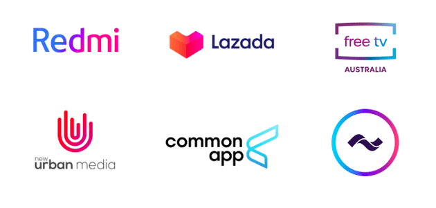
The unique thing about color gradient is that it fits perfectly with just about every other trend. Our prediction is therefore that the power of color gradient will fade quickly. In 2020 it will first peak. Prepare to see fascinating neon hues on even minimalist designs.
Messy composition
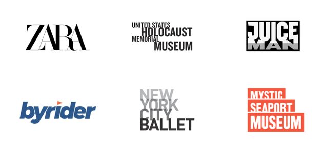
If you are skeptical about pieces with a lot of white space, then this next trend is definitely not for you. According to experts, messy logos become the hallmark of the 2020 design scene. The trick is that the abundance of elements conveys the sense of reliability. This applies in particular to geometry-based emblems. If you want to gain trust with your target group, you know what to do!
Chaotic arrangement

A somewhat chaotic approach is yet another daring trend that is rebelling against conventional standards. If you want to show the innovative personality of your company, don’t be afraid to add a drop of chaos to your logo. Surprise your audience with unexpected graphic solutions. However, do not go too far, because then you risk transforming your design into an unreadable mess.
Accentuation
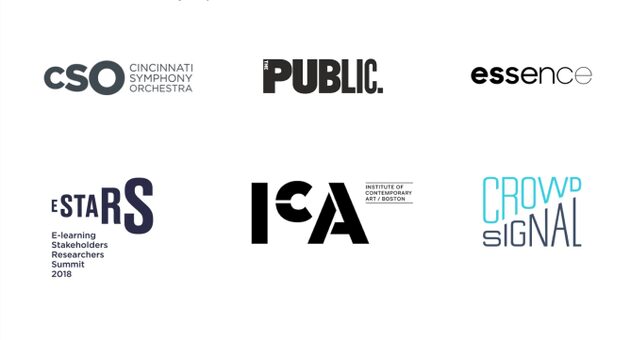
One of the best ways to get your customers’ attention to a specific part of your logo is to highlight this. Try using other techniques this year instead of saturated tones to distinguish the selected letter or image. For example, you can apply scales, draw thicker lines, add shadows, etc. Markers look particularly good with text logos, making them firmer and visually more stable.
Geometric letters

Modern designers put a lot of effort into reinventing text logos. What do you think of letters or parts of them consisting of geometric figures? This original technique has been gaining popularity for some time. Get ready to reform this trend for the logo design industry, as it is expected to become very large in 2020. Our advice is to combine geometry-based letters with gradients and markings.
Emblems
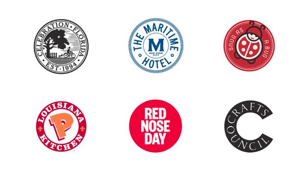
Although the global design community is following a course towards simplification, detailed emblems show no signs of decline. However, the year 2020 will also be adjusted in this continuing trend. In the coming year, emblems will lose some of their complexity and sophistication to become more concise. This change is intended to make emblems lighter and therefore more readable. If you are looking for a way to show your brand’s appreciation for tradition, a neat emblem will not disappoint you in this regard.
Text destruction
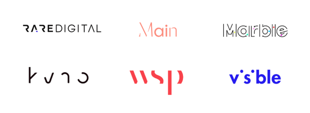
The latest design technology on our list can be traced to the trend of lost fragments. When you use text destruction, you intentionally leave the logo incomplete. To achieve the desired visual effect, you can use fading lines, semi-visible shapes, etc. Text destruction is all about hints and guesses. When you look at an incomplete piece, the viewer cannot help recreating the missing parts in his head. This smart method works like a magnet, stimulates the imagination of your audience and ensures that they remember your logo. In 2020, playing with the audience will be the next big thing!
That was our vision of the biggest logo trends of the coming 12 months. The Logaster team is delighted to see how the year 2020 will change the graphic design universe. We also hope that our prediction will help you create a heartbreaking logo for your brand!
This is a guest contribution from Logaster, the online logo maker.

